Introduction
I do write blogs, newsletters, but this is something wild I had written in a while. I was always curious and interested in knowing about the flights flowing over Mumbai, I do always look up and see the Airline when it appears above my head in front or on the side. But I never actually read or discovered anything true or factual about it. As a software developer, that is very unsettling, I have some ideas and observations but never tested them. I can excuse myself that I am busy and that is a toy little project to get off my hands. But now, we have LLMs and no excuses. I don't need a second invitation to explore my curiosity, off I went.
And came back with around a week or 2 of digging in data, downloading the ADS-B stream of airspace and crunching the numbers for the BOM (VABB) Mumbai's Chatrapati Shivaji International Airport (CSMIA) and its vicinity. The numbers I must tell you were staggering and I couldn't stop starring at them, I felt relieved and felt my childhood was worth while.
I am writing this blog post to explain to myself, how I got here. It was a chaos in start, total misery of data. But after a few attempts of successfully accumulating the data only for BOM airport's vicinity of 300 kilometers, I was able to finally make sense of the pile of data (since at one point it looked like a goble of mess).
This will be a two part blog. This one being non-technical (that is no grilling from peer developers) which will explain the why and what of the case study of the Mumbai Airport. The next part (out in a couple of days from now) will be a treat for developers (or curse words for myself, ok it won't be that bad), which will explain the how.
This part is about my intuitions and the memories I had since growing up near the vicinity of Mumbai Airport. I explain what dataset I used (it was not a simple available dataset in the public, mind you that), how I structured it, what questions I asked, how I formed the queries (not in terms of SQL but human logical terms), and how I reason through the results. And trust me everything made sense.
So, if you have been in Mumbai, and wondered how many planes flew above your head in a day, you are in for a treat! Buckle up! Because Mumbai Airport never stands still.
Check out the full case study here -> Flight Observatory - Mumbai Airspace Case Study
Flashback of Mumbai from 2010-2018
I have spent my life in Mumbai, the two decades that I have lived here, I often feel nostalgic lookin back at the memories. The one that stands out even today is the plane spotting. Since childhood, I have seen, heard, observed planes flying above me, beyond the buildings, buzzing and slashing the concrete jungles and flat blue slums. I distinctly remember the days from my school, the 7th A classroom, located on the top of the school, the highest room on the school. I remember the days I shared sighting planes through the periods with my friends.
It was a nostalgic experience to see
- the regular "Air India" on time,
- "Lufthansa" with its guzzling sound,
- occasional "UPS" with the jumbo cargo,
- and the millions of "Jet Air" and "Spicejet" among them.
There was a different joy of just seeing and observing them, admiring the beauty of Boeing 787, 777 and 747s, Airbus A330 and occasional very rare Airbus A380 the king. Those are fresh in my mind. I was lucky to be honest to have an airplane enthusiastic friends with me. One of them was notoriously a die-hard fan of British Airways though. The 11:45 British Airways was a treat to him, with me cursing words at British people, hoping the plane to crash (just teasing him of course).
We almost had a anticipation on the next plane to come and over the year we had a schedule that which one will come next depending on the period at the day. We had formulated that the BOM Airport's frequency was 2:30 minutes (that's 24 flights in an hour, 576 in a day). That is a lot of flights landing over our head, I used to brag that BOM was (is?) the single runway busiest airport. And take a strange pride in defaming British Airways. Those were the times :)
And now, I don't have that luxury to sit with that friend and gaze at the sky (if I will, I might get existential crisis I think). I wanted to get those moments back, I don't have the luxury to sit with that friend though, but I realize I have another friend a tool of sorts. LLMs.
I realize I am a programmer now, whatever I want to do, I can. Its just a wish away.
The Idea
And I began making this project. To observe the sky. Not by my eyes. By tracking, analyzing and crunching data from APIs.
Nothing comes for free. Constraints start developing, but there is no engineer who has no constraints. For me I didn't want to setup a cloud infrastructure(not that I can't I just don't have the budget for it) and do bunch of credit card swipes, I didn't have the luxury for that, and for buying heavy 200$ subscription of those AI-tools either. So what?
Engineers aren't made from freedom. They're shaped by constraints.
I explored every API out there to see what I can use the best. And lo and behold I found some. Not everything was great, there were samples, just a day for a month, limited data, but I kept digging and digging. I found what I needed, data points for Mumbai (or any airport for that matter) across a decade. I thought I might get full-day, full-year data, a decade worth of data. But what I got was a decade worth of data, for all months, but only for the first day of the month. Sigh!
But I kept moving. I don't care how little the data is. It is real. It is 12 days of the year for 8 years. That is not a lot, but enough to find patterns. And I can surely say, Mumbai airport hasn't changed drastically over the decade.
I thought that was not enough! I wanted more, I wanted live data. Can I get live? I though I could, I did but sort of. Its not the most accurate representation of flights. But a good guess, a practical one at least.
So, I built Flight Observatory. A live and historical data analysis tool or a webapp of sorts for viewing flights captured by the ADS-Bs around the world. I kept storing the live data and gobbled them into a historical section. From the other dataset and some live observations(which turned out to be a disappointment) I also made a case study for Mumbai Airport.
This will be not quite nerdy and technical, even if you are not a technical person, strap on. Its going to be a fun read. The next part will be a treat for the technical people reading this, so put on your glazing glasses and bickering comments for that post later.
What I found (TLDR)
Mumbai Airspace is very consistent. It is busy in a very Mumbai way: a lot of movement, but with a clear pattern. The traffic pattern is strongest in the early morning and evening.
The daily activity spreads across the early morning, the workday, and the evening. In the airport-proximate analysis:
- The strongest hourly movement shows up around 07:00 IST
- Other heavy hours around 06:00, 11:00, 17:00, 20:00, 21:00, and 22:00.
On the sampled days, the data produced:
21,923airport-proximate events- Split into:
12,723landings9,200takeoffs
- With a median landing-to-next-takeoff gap of
1.5minutes.
That last number matters. It is the airport's strength and the health checkup number. It says the airport is turning movements over very quickly, which matches the reputation Mumbai has for being tightly packed.
The airspace itself is occupied for a while:
- Median landing run:
34.5 minutes - Median takeoff run:
25.1 minutes
So landings stay visible longer than takeoffs. That makes sense operationally, arrivals spend more time in descent and approach, while departures clear out faster once they lift off.
The same aircraft also comes back around fairly quickly:
- median same-aircraft ground time:
96.5 minutesThat means the aircraft are not sitting idle for long. The fleet is being reused in a steady loop, which fits a high-frequency airport like Mumbai.
And the shape of the traffic is not random:
- Saturday is the busiest weekday in the sample
- the landing and takeoff corridors split cleanly across the airport area
- the dominant heading clusters show the same directional axis being used again and again
Across the full analysis set, I ended up with about
- ~17 million observations (that looks like a gigantic lot, but it isn't)
- ~151,000 inferred flight runs
- Spread across ~4,900 aircraft hexes
- ~4,800 registrations
- ~140 aircraft types.
That feels right for Mumbai. It is a city that never really stops moving (it actually sleeps, but internationally awake), and the airspace behaves the same way. The airport-proximate movement counts are also not tiny, it is structured, dense, and repetitive. The airport works like a tight system, not a loose one.
Notes and Clarifications
The data itself was not clean in the neat, airline-report sense. It is raw observation data: points every few seconds, over and over again, with altitude, speed, heading, position, and callsign changing as aircraft move across the sky every 5 seconds or 30 seconds(depending on the year). I had to group those observations into inferred flight runs before it became useful. Once I did that, the picture got much clearer.
Most of the useful traffic is post-covid traffic too. The analysis is heavily weighted toward 2022 to 2025.
The ADS-B for the BOM (VABB) actually started the tracking of airports around late 2017, early 2018, and that too was per minute. So it was very sparse and not necessarily capturing the full spectrum. This data is from 2018 to 2026, not the full day of each month. It is sampled to be the first full day of each month (i.e. 1st April 2024, 1st of May 2024, and so on). Also the data points from 2018 to mid-2020 is snapshot of 60 seconds and moving from late 2020 through 2026 (till march) is snapshot of 5 seconds. The data is only for ~78 days(not continuous, its the 1st day of month). 2022-2025 full years (12 days), there are only 3 days in 2018, since ADS-B was active after mid-2018, and the dip in 2020-21 due to COVID, so little or no traffic observations.
----------------------------
|  Year  |  Number of days |
---------------------------|
|  2018  |      3          |
|  2019  |      11         |
|  2020  |      5          |
|  2021  |      9          |
|  2022  |      12         |
|  2023  |      12         |
|  2024  |      12         |
|  2025  |      12         |
|  2026  |      3          |
----------------------------
The numbers are real, but they are still a proxy. They are not ATC logs. They are not airport ops records. They are ADS-B-derived movement patterns around Mumbai. That means the data is powerful for showing pattern, density, clustering, and dominance, but it should not be mistaken for official runway statistics. This data doesn't infer the activity the airport is doing exactly as in an official ATC sense, but it does tell you something real about how packed and continuous the traffic feels once you look at it through ADS-B data.
ADS-B short for Automatic Dependent Surveillance Broadcast that allows the aircraft to capture its own position and other details like (altitude, GPS based location, direction, speed, hex code i.e. unique aircraft code) and broadcasts (sends in the open as a radio signal), this gets captured by listening Air Traffic Controllers(ATC), Airports, satellites, networks, etc which then track and use it for internal purposes. That could be then used for tracking on the Airport, communnicating, averting accidents, etc.
Initial Questions and Exploration
I was looking for a historical dataset that could show me flight activity over Mumbai. I did not expect it to be perfect, but I did expect it to be workable. The first thing to understand is that this is not a clean flight log. It is a stream of observations. Each aircraft keeps broadcasting its position, altitude, speed, heading, and identity over time. That means the raw data is not one row per flight. It is more like one row per movement in time for a given aircraft. To make it useful, I had to turn those repeated observations into inferred flight runs. That is what makes the analysis readable. Instead of staring at thousands of raw position points, I can ask more human questions:
- When is Mumbai busiest?
- Which airlines show up the most?
- Which aircraft dominate?
- Where do planes start descending?
- Where do they take off from?
- How long is the gap between one landing and the next takeoff?
That shift from raw observations to inferred runs is what made the rest of the project possible. I landed on the ADS-B Exchange historical data because it looked promising. At first glance, it seemed like I had found a long historical archive. But there was a catch I did not fully appreciate at the beginning: much of the data was sampled by month, and a lot of it was only the first day of each month. That was smaller than I hoped, but still useful enough to extract patterns from.
That was the point where I stopped thinking about the data as a raw archive and started thinking about it as something I could actually analyze.
Making "sense" of the data
So, I had millions of observations. Because a single minute has 12 snapshots and if you do the math (not asking you to do it, but if you are curious), we end up with around 17,280 snapshot for a single day (12 snapshots per minute * 60 minutes * 24 hours). If you stack it up for around 12 months, that really grows big.
So, what exactly were these snapshots? Could I directly use them in querying the database?
No, not quite. It actually depends on what questions we might need answering.
What is a Snapshot here
A snapshot is basically a list of observations (or set of status) for the aircrafts currently in the airspace. The initial snapshot that I download from ADS-B Exchange has a full world air-traffic and I never want that full data, I just want the tiny airspace around the Mumbai one. So we filter the latitude and longitude position around Mumbai. So, each snapshot finally becomes the aircrafts flying around the radius (30km to give a number) at that time. So we take those kind of snapshots at 5 second interval.
So let's suppose there are 2 flights around Mumbai currently one landing and one taking off:
These will be a snapshot.
[
    {
        "icao24": "123456",
        "latitude": "19.123",
        "longitude": "73.123",
        "altitude": 500,
        "velocity": -100,
        "heading": 90,
        "timestamp": "2022-01-01T00:00:00Z"
    },
    {
        "icao24": "8901",
        "latitude": "19.083",
        "longitude": "72.123",
        "altitude": 1000,
        "velocity": 300,
        "heading": 90,
        "timestamp": "2022-01-01T00:00:00Z"
    }
]
After 5 seconds you might see a change in the latitude and longitude (positions), the speed, and the altitude (also the timestamp). So we get another snapshot which shows the status of those aircraft currently in the radius of Mumbai, maybe in the next snapshot another aircraft is about to land, so it appears in the snapshot too. So on, you get the point right? If the aircraft stays within the radius of Mumbai for more than a minute (which everyone might, often more than a minute even 10-20 minutes?) then we might have 12 observations for that aircraft across those snapshots. We basically have a record or a progression of the aircraft over time. That is, in essence, a time series data. We are measuring a change of an entity over a period of time.
So, this is what I get from the downloaded snapshots which are in millions.
How do I make sense of them?
Well, let's ask a question, then the scope can be reduced or we can move in specific direction.
Questions on the data
What are the total number of flights over Mumbai in 2026 so far?
Well, now you can see, we are talking about flights or distinct aircraft over a time. That is a distinct thing from the observations we have, we have to first lock in the time, but the deeper question is how do we group these observations to get flights?
That is why the question need to change a little before it can be answered properly. I am asking how many distinct flight runs exist in the data, how long they last, when they start, when they end, and whether they are landing, taking off, or just passing through the Mumbai airspace. Once I do that, the raw snapshots stop being noise and start becoming something I can actually reason about.
So, what constitutes a flight run? That is a question that we need to answer before proceeding.
What is a Flight Run
A flight run is my way of saying: this group of observations belongs to the same aircraft movement. It is not one row, and it is not one timestamp. It is the whole stretch of time where the same aircraft keeps showing up in the snapshots and its position, altitude, speed, and heading keep changing in a way that looks like one continuous movement.
Now, how do we distinguish an aircraft?
A unique aircraft means one distinct plane in the dataset, usually identified by its unique aircraft code, like hex or registration.
This matters because the same aircraft can appear in many snapshots while it is in Mumbai's airspace. If I only counted rows, I would be counting the same aircraft again and again. But if I group those rows into a single run, then I can treat it more like one flight-shaped event. That gives me something much closer to what I actually want to study.
Observations to Flight Runs
So, I loaded the raw snapshots/observations into the dataset after compressing from json to csv to parquet files (dont worry about the details), into a duck database session.
I had table schema like:
observationsis just all the monthly Parquet files unioned together.observations_cleancleans the fields and turns text like altitude, speed, lat/lon, etc. into usable numeric columns.observations_enrichedadds convenience fields like registration, aircraft type, airline_code, is_indian_registration, etc.
From this we need to group into a flight run that could track each flight. So, I went and created a view that will do that:
As we know we have hex in the data for each observations, that can be used to identify unique aircrafts in the airspace, however there is a catch.
Each aircraft in ADS-B data is identified by a unique hex code, which represents the physical plane. But planes don't operate just one journey, they fly multiple routes throughout the day. This is where the callsign becomes important. A callsign represents the flight the aircraft is currently operating (for example, AI101 or 6E203).
So, we need a combination of hex and callsign to identify a flight run.
I sorted the observations by aircraft and time, and then compared each row with the one just before it. If the same aircraft disappeared for too long, I treated that as a break. If the flight code changed, I treated that as a new run too. That gave me a cleaner way to read the data. The same aircraft could still appear many times, but those repeated sightings would stay inside one continuous stretch instead of being counted as separate things. In other words, I was no longer looking at a pile of random snapshots. I was looking at movement. Once that rule was in place, the rest of the questions started making sense. I could count runs instead of rows, compare landings and takeoffs, look at how long an aircraft stayed in the airspace, and see when the traffic was building up or dropping off. That was the point where the data stopped feeling messy and started feeling usable.
That is the first step to answer the question, how many flights are there in Mumbai over 2026?
How many flights are there in Mumbai over 2026?
Once I started grouping those repeated sightings into flight runs, the question became much clearer. Instead of asking how many rows exist, I could ask how many distinct aircraft movements exist from 1st of January, February and March of 2026. That is the number I actually care about. It tells me how much traffic was visible, when it showed up, and how those movements were spread across the day.
There are approximately 7,237 inferred flight runs for the 3 full days of the 2026.
For the 12 full days of 2024, there were approximately 51,441 inferred flight runs, and for 2025 there were approximately 43,324. For 2026, it is just the first quarter (3 days compared to 12 days of those earlier years, so a good balance).
Now we can move into interesting questions
When is Mumbai most busy?
Once I had the raw snapshots grouped into flight runs and filtered down to the airport-proximate ones, the first thing I wanted to see was simple: when does Mumbai actually get busy?
For a "24 hour day" chart, I used:
- one row per hour
- count movements for each sampled day + hour
- then average those hourly counts across sampled days
That gives us a number representing on a typical sampled day, how many movements happen at 07:00, 08:00, etc.?
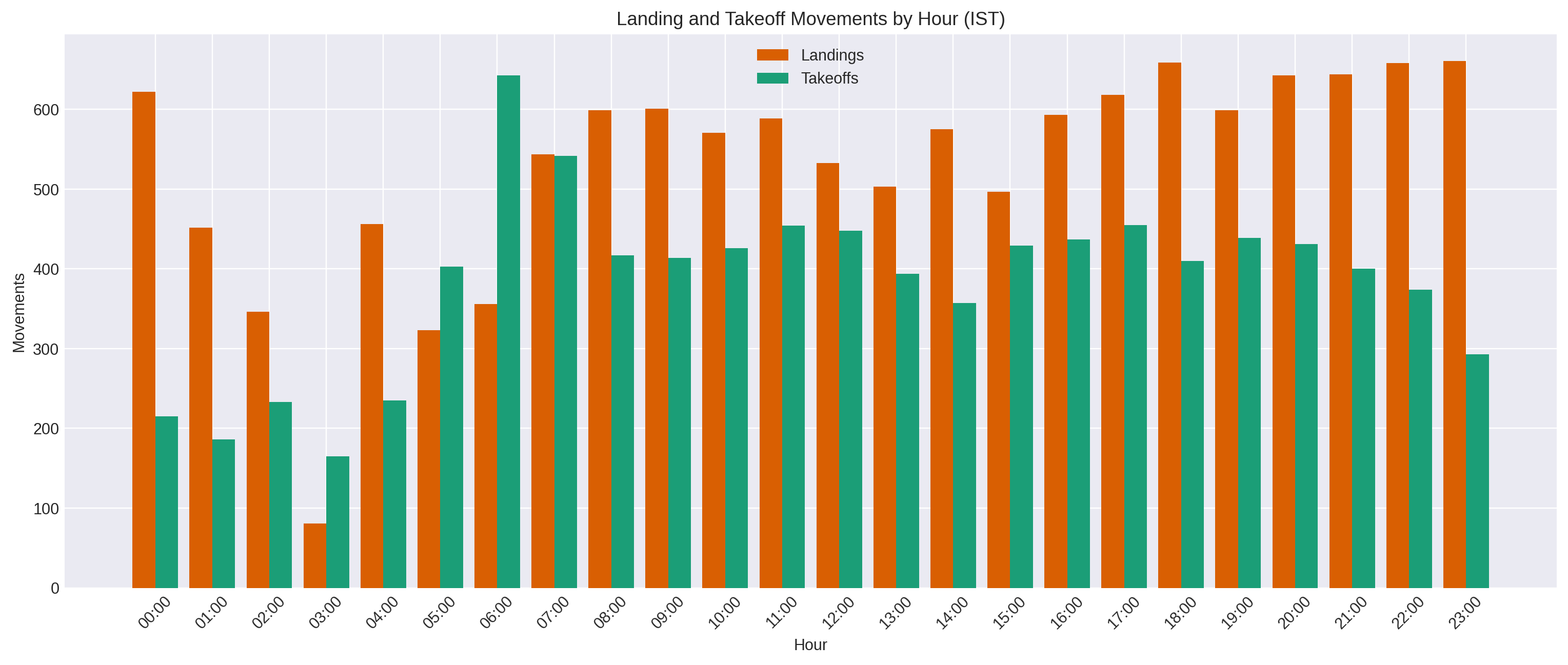
The answer is pretty clear. In this sample, the busiest hour is 07:00 IST, with 1,086 movements. Right behind it are 20:00 (1,074), 17:00 (1,073), 18:00 (1,069), 21:00 (1,044), 11:00 (1,043), 19:00 (1,038), and 22:00 (1,032). The quietest hour is 03:00, with just 246 movements. So the traffic is not flat at all. It has a shape, and that shape is very visible once you count the flights as runs instead of raw rows.
However if we take the average across all the sampled days, we get the same picture.
For construcing the query for getting this, we want to know when the airport is most active during the day, so we can:
- Keeps only airport-proximate events (lat and lon)
- Labels each event as landing or takeoff (based on speed and altitude)
- Converts the time to IST
- Groups by hour of day
- Counts movements in each hour bucket
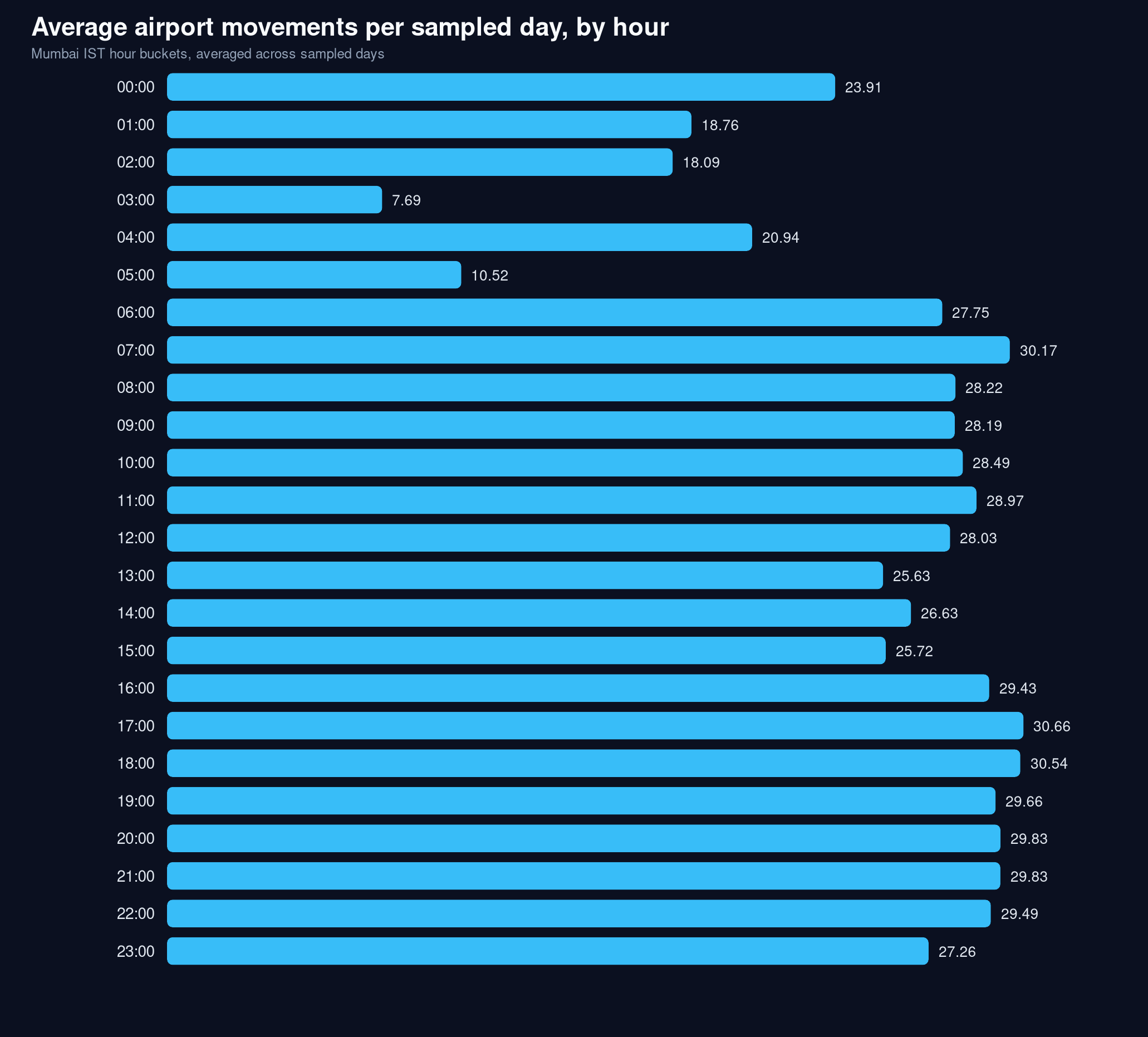
If we take the median instead, then the busiest hours are 17:00 IST, with 30.46 movements, 18:00 IST with 30.54 movements and 07:00 IST with 30.17 movements that makes it very consistent to the average. The quietest hour is still 03:00 with just 7.69 movements.
That gives us a good answer and the difference is honestly not that big. The busiest hour is 07:00 and 17:00 with summed average and median respectively, and quietest is 03:00. The summed view and the averaged view tell the same story, but from two slightly different angles. In the total sample, 07:00 is the busiest hour, followed closely by 20:00 and 17:00. In the average-per-day view, the evening shifts slightly ahead, with 17:00 and 18:00 taking the top two spots and 07:00 still staying near the top. The quietest hour is the same in both views: 03:00. So the exact peak changes a little, but the shape does not. Mumbai is still busiest in the morning and evening, and quietest in the late night.
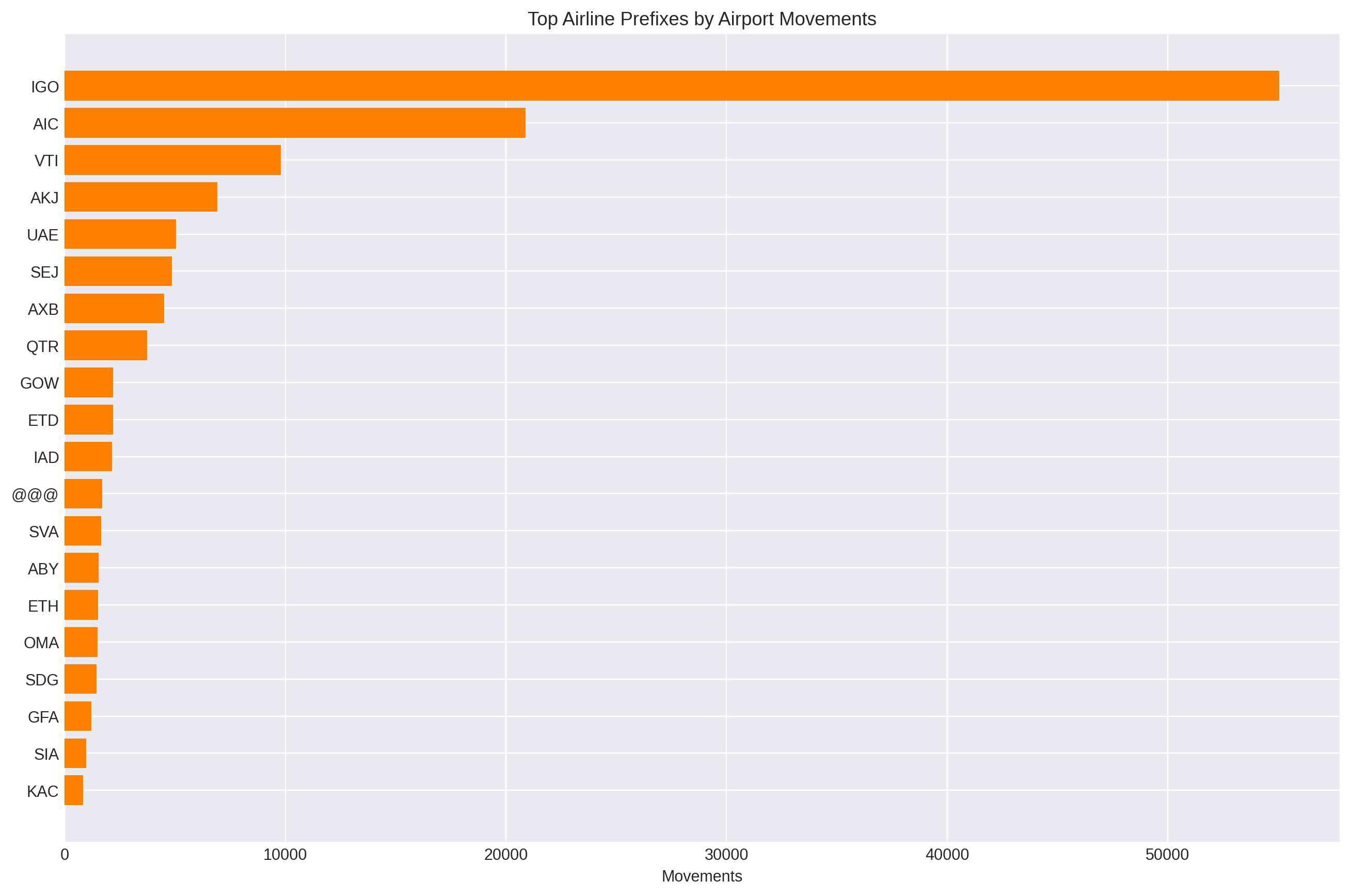
Which Airlines Show Up Most
I want to know which airlines dominate the traffic.
Once the rows were grouped into flight runs, I could stop looking at raw sightings and just count which airline codes kept appearing. I used the first part of the flight code as a rough airline label and counted the runs for each one. That makes the dominant carriers obvious instead of buried inside repeated observations.
What I did was with a query:
- Takes the grouped flight runs
- Pulls the airline prefix from the flight code
- Counts how many runs each prefix appears in
What we get:
- A dominance chart
- It shows which carriers keep repeating in the sample
- IndiGo and Air India should stand out immediately
This was quite evident, as I have observed Mumbai's sky for a long. Indigo and Air India are firmly dominant across the board. However, there are some other interesting observations like Vistara Air, Akasa and Emirates. In earlier pre-covid era, it used to be Jet Airways, but now Indigo has taken the lead.
The difference in the first 3 is quite a big one, and I think its right! Since Indigo and Air-India, not only in Mumbai, they are preferred over other domestic airlines.
Some other notable ones down the order are SIA for Singapore Airlines, DLH as Lufthansa, and BAW as British Airways. They are not as heavily appearing as domestic ones, they are regulars on a routine, each day every day.
┌──────────────┬───────────┐
│ airline_code │ movements │
│   varchar    │   int64   │
├──────────────┼───────────┤
│ IGO          │     55050 │
│ AIC          │     20892 │
│ VTI          │      9789 │
│ AKJ          │      6923 │
│ UAE          │      5057 │
│ SEJ          │      4869 │
│ AXB          │      4514 │
│ QTR          │      3728 │
│ GOW          │      2191 │
│ ETD          │      2186 │
│ IAD          │      2151 │
│ @@@          │      1708 │
│ SVA          │      1660 │
│ ABY          │      1542 │
│ ETH          │      1504 │
│ OMA          │      1479 │
│ SDG          │      1448 │
│ GFA          │      1214 │
│ SIA          │       979 │
│ KAC          │       825 │
│ DLH          │       771 │
│ THY          │       754 │
│ MAS          │       745 │
│ BAW          │       721 │
│ FDB          │       705 │
└──────────────┴───────────┘
A good validation query! It seems the data was correctly analysed.
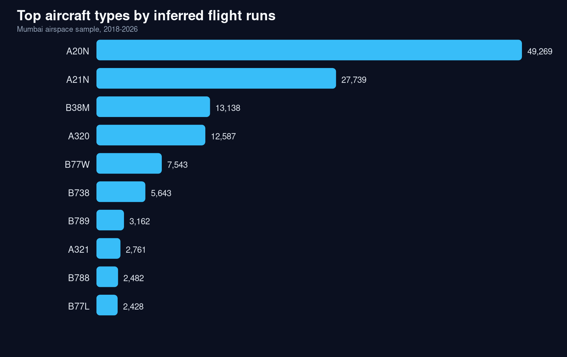
Which Aircraft Type Dominates
This was something I didn't have much idea about. I was not well versed with flight models and their names. So I let it shape what we can find.
┌────────────────────────────────────────────────┬───────────┐
│ aircraft_type                                  │ movements │
│    varchar                                     │   int64   │
├────────────────────────────────────────────────┼───────────┤
│ A20N (Airbus A320neo)                          │     49269 │
│ A21N (Airbus A321neo)                          │     27739 │
│ B38M (Boeing 737 MAX 8)                        │     13138 │
│ A320 (Airbus A320)                             │     12587 │
│ B77W (Boeing 777-300ER)                        │      7543 │
│ B738 (Boeing 737-800)                          │      5643 │
│ B789 (Boeing 787-9 Dreamliner)                 │      3162 │
│ A321 (Airbus A321)                             │      2761 │
│ B788 (Boeing 787-8 Dreamliner)                 │      2482 │
│ B77L (Boeing 777-200LR / 777 freighter family) │      2428 │
│ A359 (Airbus A350-900)                         │      2385 │
│ A333 (Airbus A333)                             │      2067 │
│ AT76 (A319)                                    │      1862 │
│ A319 (Airbus A319)                             │      1736 │
│ A388 (Airbus A388)                             │      1648 │
└────────────────────────────────────────────────┴───────────┘
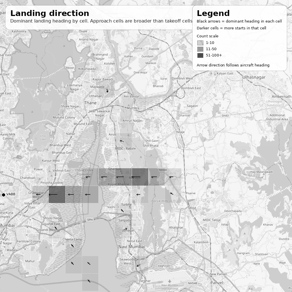
Where Landings Start
The question here is not where the aircrafts lands on the runway. It is where the aircrafts start coming down. That is a different thing. If I want to find the landing corridor, I should not look for the final stop point. I should look for the first clear movement in each run when the altitude starts dropping in a way that looks like descent. That gives me the start of the landing path, which is what matters for the map.
Once I have those descent-start points, the next step is simple: group them by location and altitude. If the same area keeps showing up, that means aircrafts are repeatedly beginning their descent there. That is how the east-side corridor and the Ghatkopar-area low altitudes start making sense. The map is not showing a single landing dot. It is showing the place where arrival begins to feel like arrival.
The patterns for a sharp dip is observed near the airport only, but overall, the gradual dip is seen on the Navi Mumbai side which is very true. The aircrafts gradually lowering their speeds and altitude descending into the runway strip.
- 19.09,73.02 is east of the airport, out toward the eastern Mumbai / Thane creek / Navi Mumbai corridor.
- 19.09,73.08 and 19.09,73.10 are farther east, so they sit deeper into the Navi Mumbai / Airoli / Ghansoli / Thane-side approach corridor.
┌────────────┬────────────┬────────────────┬────────────────────┬───────────────┐
│ lat_bucket │ lon_bucket │ descent_points │     avg_alt_ft     │ median_alt_ft │
│   double   │   double   │     int64      │       double       │    double     │
├────────────┼────────────┼────────────────┼────────────────────┼───────────────┤
│      19.09 │      73.08 │            142 │ 3405.6338028169016 │        3400.0 │
│      19.09 │       73.1 │            135 │  3652.962962962963 │        3600.0 │
│      19.09 │      72.86 │            133 │   36.2406015037594 │           0.0 │
│      19.09 │      73.02 │            123 │  2638.008130081301 │        2625.0 │
│      18.58 │      73.94 │            122 │ 2115.1639344262294 │        2175.0 │
│      19.09 │      73.01 │            119 │  2439.285714285714 │        2425.0 │
│      19.09 │      73.11 │            118 │ 3747.4576271186443 │        3750.0 │
│      19.09 │      73.09 │            116 │ 3565.0862068965516 │        3525.0 │
│      19.09 │      72.94 │            113 │ 1342.9203539823009 │        1350.0 │
│      19.09 │      73.12 │            113 │ 3951.7699115044247 │        3925.0 │
│      19.09 │      73.23 │            108 │ 5678.7037037037035 │        5675.0 │
│      19.09 │      73.24 │            102 │  5867.156862745098 │        5850.0 │
│      19.09 │      73.13 │            101 │  4157.425742574257 │        4175.0 │
│      19.09 │      73.07 │             99 │ 3325.5050505050503 │        3325.0 │
│      19.09 │      73.18 │             97 │  4990.721649484536 │        5025.0 │
│      19.09 │       73.2 │             97 │  5232.216494845361 │        5175.0 │
│      19.09 │      73.14 │             96 │  4284.635416666667 │        4275.0 │
│      19.09 │      72.91 │             94 │  819.4148936170212 │         862.5 │
│      18.58 │      74.01 │             92 │ 3408.4239130434785 │        3400.0 │
│      19.09 │       73.0 │             92 │  2288.586956521739 │        2300.0 │
...
...
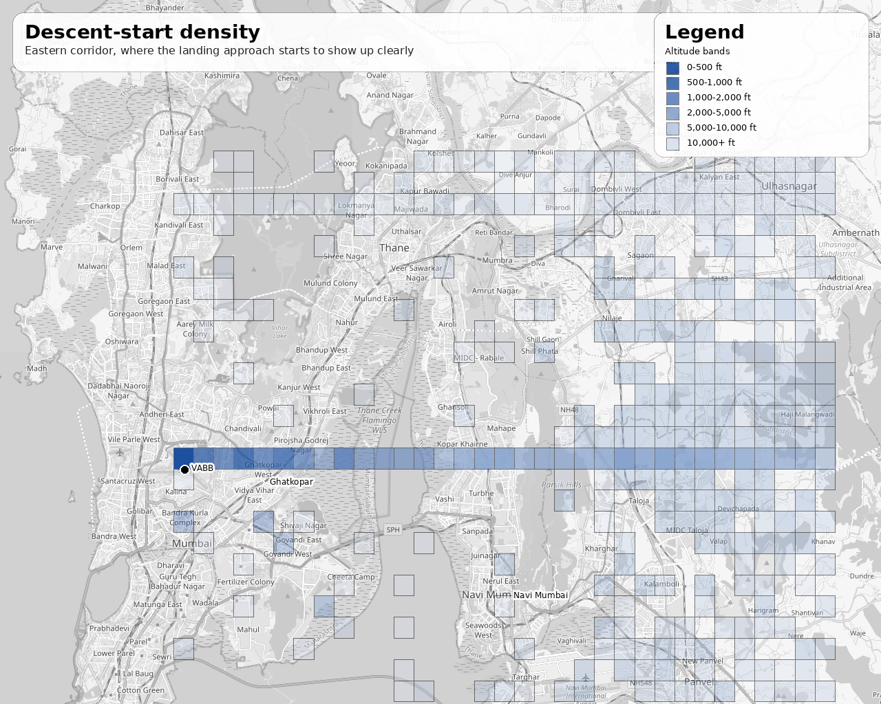
A clear strip can be seen with the aircrafts descending into the runway strip. Also the dip is more pronounced in the Navi Mumbai / Airoli / Ghansoli / Thane-side approach corridor.
I also looked for a query on the Ghatkopar region, and it was amazing to see that it was so near. Around 19.08, 72.94 is Ghatkopar, and aircrafts have an approximate average of 800 feets. 90% of them are below 1,100 feet, that is crazy low. And that clearly explains why the strip straight to the East-West of the airport line (which some part of Ghatkopar falls into) doesn't have any tall towers.
┌────────────────┬───────────────────┬───────────────┬────────────┬────────────────────┐
│ descent_points │    avg_alt_ft     │ median_alt_ft │ p90_alt_ft │     p95_alt_ft     │
│     int64      │      double       │    double     │   double   │       double       │
├────────────────┼───────────────────┼───────────────┼────────────┼────────────────────┤
│            395 │ 859.7544303797469 │         775.0 │     1175.0 │ 1332.4999999999989 │
└────────────────┴───────────────────┴───────────────┴────────────┴────────────────────┘
Another good metric to verify the dataset is proving right.
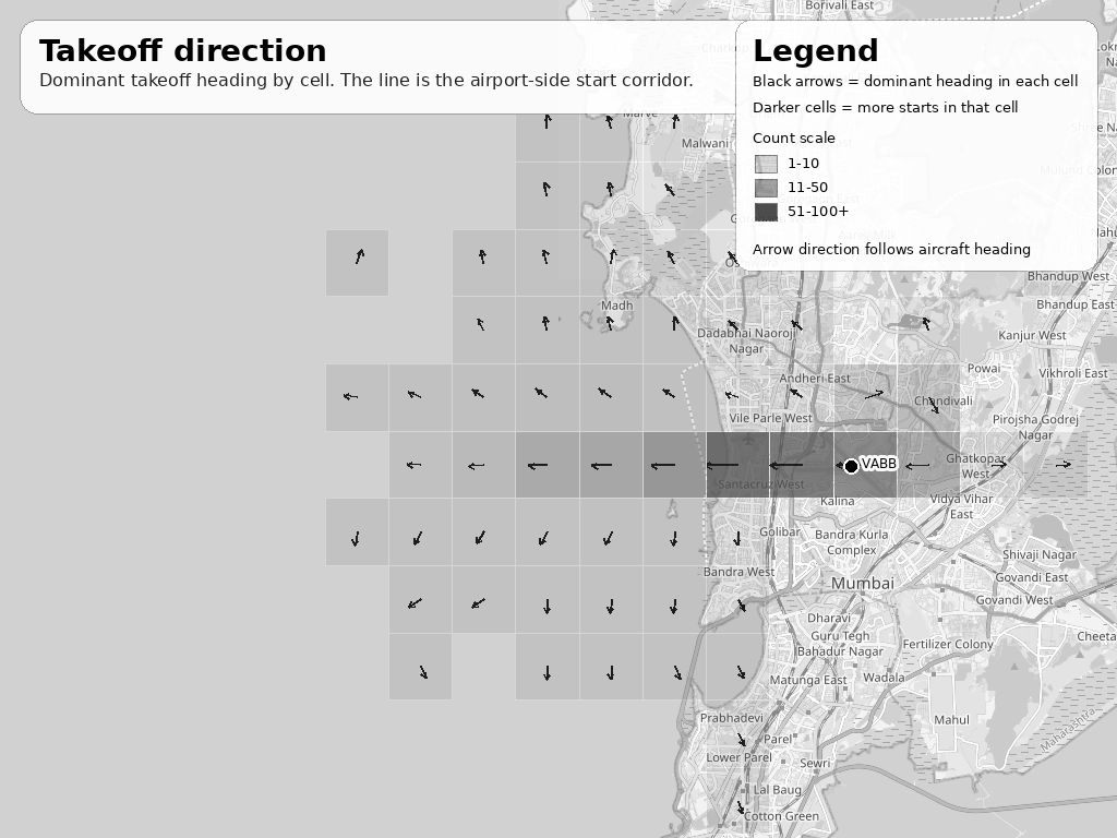
Where Takeoffs Start
Takeoffs are the same idea in reverse. The question is not where the plane ends up in the sky. The question is where it starts climbing away from the airport. So instead of looking for a finished takeoff, I look for the first point in each run where altitude clearly begins to rise. That gives me the start of the departure path.
Then I group those start points by location. If the same area keeps lighting up, that tells me where departures are really getting going. That is why the takeoff map is tighter and closer to the airport than the landing map. It is not trying to show the whole flight. It is only trying to show the first step out of the airport, which is the part that makes the pattern visible.
The sharp climb starts very close to the airport itself, and that is what the takeoff pattern shows clearly. The aircrafts begin to gain altitude almost immediately after leaving the runway, so the takeoff strip stays tight around the airport side instead of spreading out far into the city.
19.09,72.81and19.09,72.82sit just west of the airport and catch the early climb corridor right after liftoff. This is the sea side, beyond the Juhu aerodrome, perfect.19.09,72.78to19.09,72.80are a little farther out, but they still belong to the same western departure corridor, showing that the climb pattern stays compact near the field.19.09,72.84,19.09,72.85,19.09,72.86, and 19.09,72.87 are even closer to the airport edge, so they sit in the immediate departure strip where the climb becomes visible first.
┌────────────────────┬───────────────────┬────────────────┬────────────────────┬───────────────┐
│     lat_bucket     │    lon_bucket     │ takeoff_points │     avg_alt_ft     │ median_alt_ft │
│       double       │      double       │     int64      │       double       │    double     │
├────────────────────┼───────────────────┼────────────────┼────────────────────┼───────────────┤
│              19.09 │             72.81 │           1473 │ 2092.6171079429737 │        2050.0 │
│              19.09 │ 72.82000000000001 │           1446 │ 1889.3672199170123 │        1825.0 │
│              19.09 │             72.84 │           1374 │ 1094.5778748180494 │        1075.0 │
│              19.09 │ 72.85000000000001 │           1329 │  764.8796087283672 │         725.0 │
│              19.09 │             72.83 │           1208 │ 1518.4395695364237 │        1450.0 │
│              19.09 │             72.87 │           1079 │  465.8016682113068 │         200.0 │
│              19.09 │              72.8 │            994 │ 2233.6770623742455 │        2150.0 │
│              19.09 │             72.86 │            848 │  698.1816037735849 │         400.0 │
│              19.09 │             72.79 │            538 │  2579.460966542751 │        2525.0 │
│              19.09 │             72.78 │            486 │  2790.792181069959 │        2750.0 │
│              19.09 │             72.77 │            418 │ 3224.5215311004786 │        3000.0 │
│              19.09 │             72.76 │            331 │ 3665.7099697885196 │        3475.0 │
│              19.09 │             72.75 │            234 │ 3924.5726495726494 │        3662.5 │
│              19.09 │             72.88 │            206 │  976.2135922330098 │         200.0 │
│              19.09 │             72.74 │            137 │  4216.605839416058 │        3875.0 │
│              19.09 │             72.73 │            129 │  4780.232558139535 │        4925.0 │
│              19.09 │             72.72 │             68 │  4781.985294117647 │        4837.5 │
│              19.18 │             72.74 │             62 │  7492.741935483871 │        7325.0 │
│              19.19 │             72.75 │             62 │  7558.870967741936 │        7525.0 │
│ 19.080000000000002 │             72.73 │             54 │  5360.185185185185 │        5162.5 │
...
...
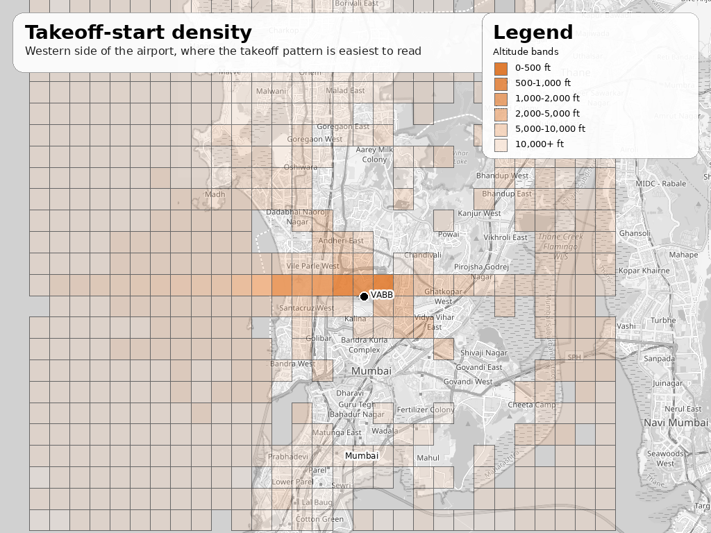
There is no major analysis here, since it has plain ocean in front of it, we can't really track the location thereafter. We can just use the direction that we'll check separately.
Frequency of landings and takeoffs
I wanted the spacing between landings on their own, and takeoffs on their own. So I grouped the airport events by type, sorted them in time order, and measured the gap between one landing and the next landing, and one takeoff and the next takeoff. The median is the number to trust most here, because a few long gaps pull the average up.
The process was simple:
- Classify events as landing or takeoff
- Sort by time inside each sampled day
- Compare each event to the next event of the same type
- Measure the minutes between them
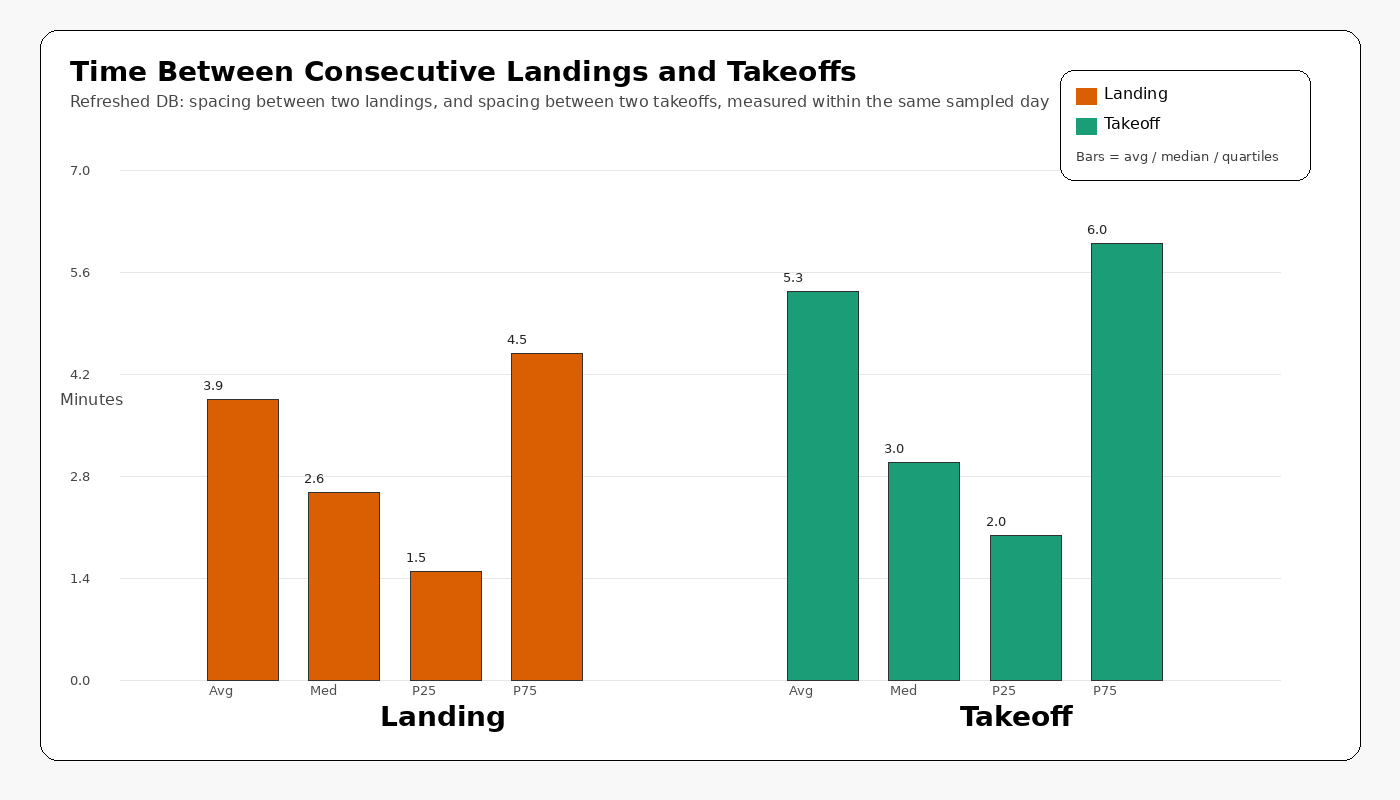
In this sample, landings are spaced about 2.58 minutes apart at the median, and takeoffs about 3.0 minutes apart.
What can we observe from this?
- Landings are spaced a bit more tightly than takeoffs
- Takeoffs have a slightly longer pause between consecutive events
- The median is the number to trust most here, because a few long gaps pull the average up
This is the answer I have been chasing all along and it truly feels great to see it that close. As children we had observed the landing frequency as around 2 minute 30 seconds, and it couldn't be more accurate than this. But the great thing about the BOM/VABB Airport is that it still holds true even after a decade. It truly is the single runway busiest airport.
Landing-to-Takeoff Gaps
I want to measure the time between a flight landed and another took-off (not the same aircraft), any flight, like just after a flight landed, how much time it took for another to takeoff. I think it has to be in the range of 1-2 minutes. That's the status BOM/VABB Airport has to be the busiest single run way airport. Let's check and validate it with data.
To answer that, I look at the airport events in time order and take each landing as a starting point. Then I find the next takeoff that follows it and measure the time gap between the two. If that gap is small, it means the airport is keeping the movement going very quickly. If it is large, it means there was a longer pause before the next departure. The interesting part is not the average alone, but the shape of the gaps across the sample.
In this sample, that gap is very short most of the time. The median is 1.5 minutes, and the average is about 2.1 minutes, across 5,297 landing-to-takeoff intervals. Most of the bars are packed into the first few minutes, which tells me the airport is turning movements over very quickly. The long tail is there too, but it is small. So the real story is not "there are a few huge delays" it is that the typical landing is followed by a takeoff almost immediately.
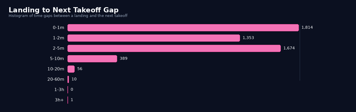
And another question with intuition validated with data.
If you think about it for a while, the median is 1.5 minutes, if you do the math (60/1.5 = 40 movements / hour). That alligns well with the hourly average. And it even validates the historical peak of Mumbai of 51 movements with 1,036 daily movements, that number is not far.
It is that the airport's fame comes from how little space there is between operations. The chart makes that visible: most of the time, the next takeoff follows a landing almost immediately, and that is exactly the kind of traffic that built BOM's reputation.
Weekday Pattern
This is a bit interesting question, since I honestly had no clue about the answer. I thought every day would have the same pattern. I was wrong.
To get this, it was straight forward. I took the airport events I had already classified as landings and takeoffs, grouped them by weekday in Mumbai time, and counted how many movements landed in each bucket. That gives a simple answer to a simple question: which day of the week gets the most airport activity? This question is asking about the breakdown of the flights based on days of the week.
┌─────────────┬──────────────┬──────────┬──────────┬───────────┐
│ weekday_num │ weekday_name │ landings │ takeoffs │ movements │
│    int64    │   varchar    │  int128  │  int128  │   int64   │
├─────────────┼──────────────┼──────────┼──────────┼───────────┤
│           0 │ Sunday       │     1444 │     1239 │      2683 │
│           1 │ Monday       │     1383 │      942 │      2325 │
│           2 │ Tuesday      │     1695 │     1337 │      3032 │
│           3 │ Wednesday    │     1748 │     1053 │      2801 │
│           4 │ Thursday     │     1805 │     1236 │      3041 │
│           5 │ Friday       │     1859 │     1323 │      3182 │
│           6 │ Saturday     │     2789 │     2070 │      4859 │
└─────────────┴──────────────┴──────────┴──────────┴───────────┘
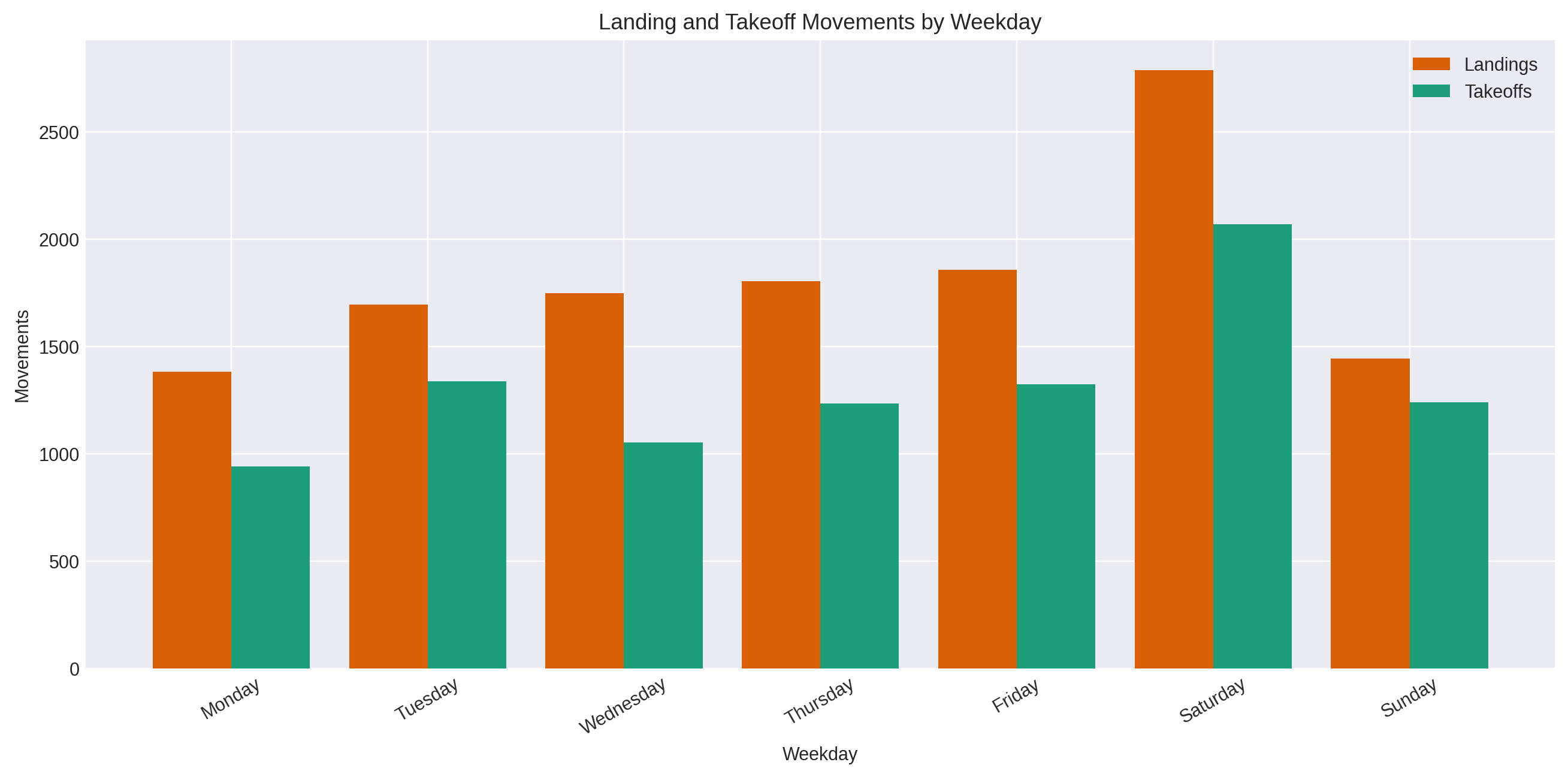
The result is pretty clear in the sample. Saturday stands out as the busiest day by a wide margin, with 4,859 movements, followed by Friday at 3,182 and Thursday at 3,041. Monday is the quietest at 2,325.
Landings are higher than takeoffs on every weekday, but the weekend spike is the real signal here. So the sample does not look evenly spread across the week, it has a strong Saturday peak and a weaker Monday trough.
I then looked into the dataset and tried to find the count of each day in the sample, since i had around ~70 days of data (1 day * 12 months * 6 years)
- Saturday 12
- Sunday 11
- Wednesday 11
- Friday 11
- Tuesday 10
- Thursday 10
- Monday 8
And that can explain why Saturday is the busiest day. The sample is not evenly distributed, but it is more or less evenly distributed across the calendar.
Hotspots / Direction
The question here is when the aircrafts starts landing or taking off, what direction are they actually pointing? That's quite obvious right? But I want to identify a deeper pattern here, from where are they coming from and where are they heading towards.
That matters because it tells you whether Mumbai's traffic is spread randomly across the compass or funneled through one stable corridor. If the airport is using the same flow again and again, the headings should cluster into a small set of directions instead of being evenly scattered.
To get this, we can:
- take each inferred flight run
- classify as a landing or takeoff
- capture the heading at the relevant point in the run.
For landings, it uses the heading at the end of the run. For takeoffs, it uses the heading at the start.
Those headings are then grouped into direction sectors and counted, which is what produces the direction chart.
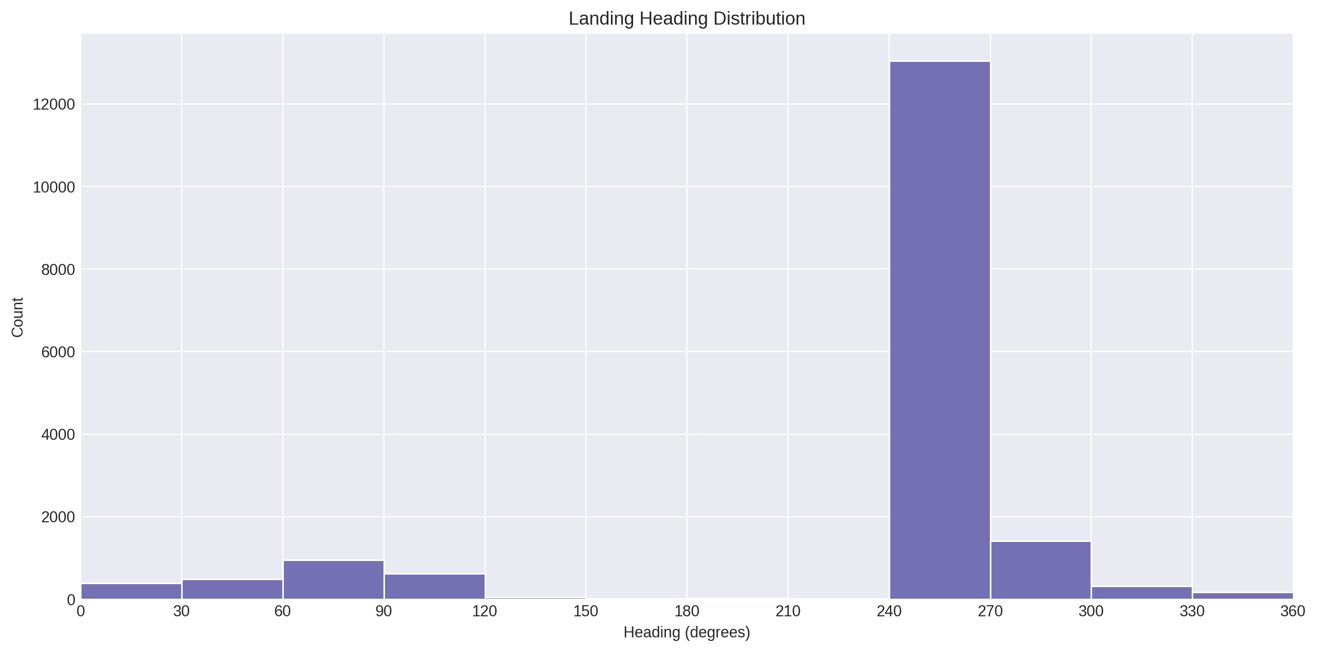
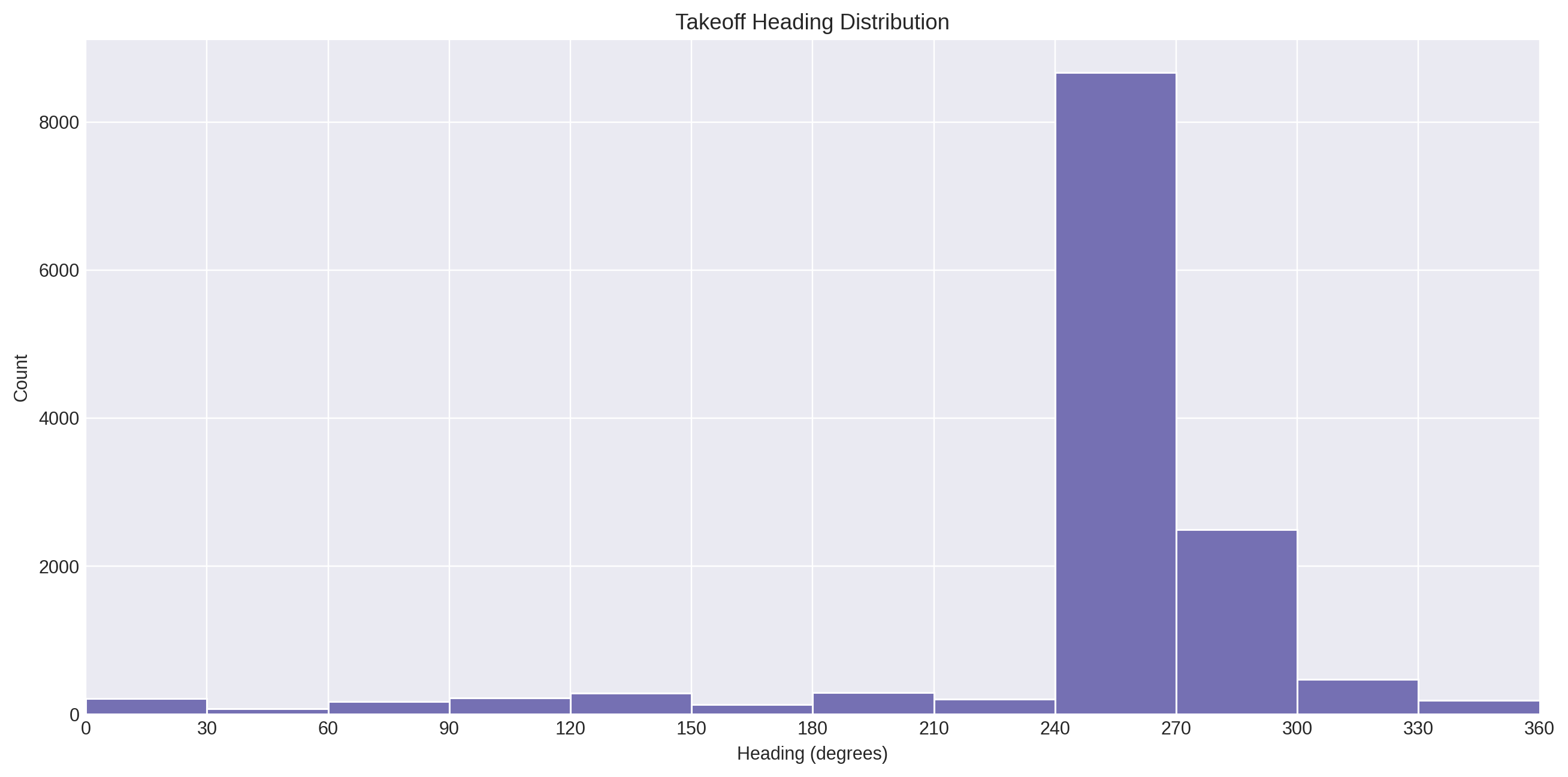
The result is very strong and very repetitive. Most landings cluster around 270°, with a smaller 90° cluster, and takeoffs are also dominated by 270°. In the heading data, the top landing sector is 270° with 14,316 points, and the top takeoff sector is also 270° with 10,848 points. That tells me the airport is not behaving like a random cloud of movement. It is using the same directional axis again and again, which is exactly why the hotspot map looks like a corridor instead of a scatterplot.
Time in Airspace
The question here is are the aircrafts just passing through, or do they stay around Mumbai for a while? The idea is simple, if landings take longer than takeoffs, that usually means approach and descent are keeping the aircraft in the airspace longer.
One thing I wanted to know was how long aircraft actually stay around Mumbai once they enter the airport flow.
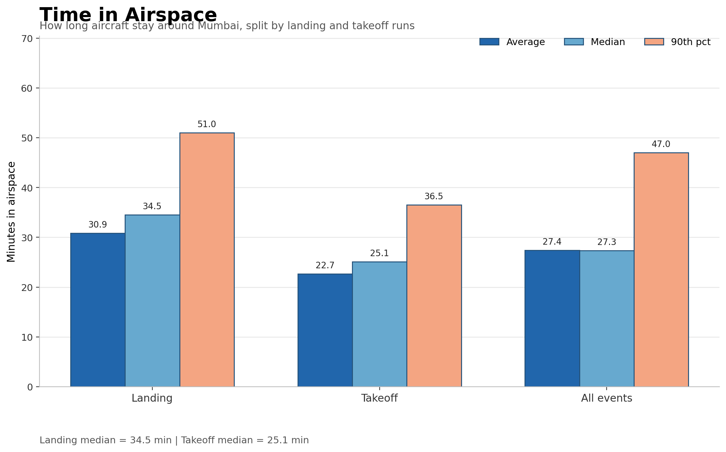
So I looked at the duration of each inferred run and compared landings, takeoffs, and the full set together. The pattern is pretty clear: landings stay in the airspace longer than takeoffs. The median landing run is 34.5 minutes, while the median takeoff run is 25.1 minutes. Across all airport events, the median is 27.3 minutes. That tells me the traffic is not just passing through fast. A lot of it is lingering long enough for the airspace to feel full, especially on the landing side.
The interesting part here is not just that landings last longer than takeoffs. It is what that tells me about the way Mumbai moves aircraft through its airspace. A landing is not a single movement. It is a long descent, even slower, and then the final stretch into the runway, so it naturally stays visible in the data for longer. Takeoffs are different. Once an aircraft leaves the runway and starts climbing out, it clears the airport zone much faster.
That is why the landing median is 34.5 minutes, while takeoffs sit closer to 25.1 minutes. This does not mean the aircraft is simply flying slower in the sky. It means the arrival side of the airport keeps aircraft in the flow for longer, which is exactly what you would expect at a busy airport like Mumbai. It also hints at sequencing and approach management: arrivals are being held in the pattern of the airport longer than departures, which is the kind of behavior that makes the airspace feel crowded even before you count the total number of flights.
So the real takeaway is this: Arrivals spend more time inside the airport's operating envelope, while departures clear out faster. That difference is part of the airport's style, and it helps explain why the airspace feels full even when the hourly flow looks ordinary on paper.
Aircraft Turnaround Time
After this aircraft lands, how long does it stay on the ground before it takes off again?
This is a good question, because it gives a deeper look at the activity on the airport. It doesn't necessarily give much but still a valid metric to observe.
So I matched each landing with the next takeoff for the same aircraft on the same day. That gives a proper aircraft-level ground-time measure, instead of a flight-level handoff.
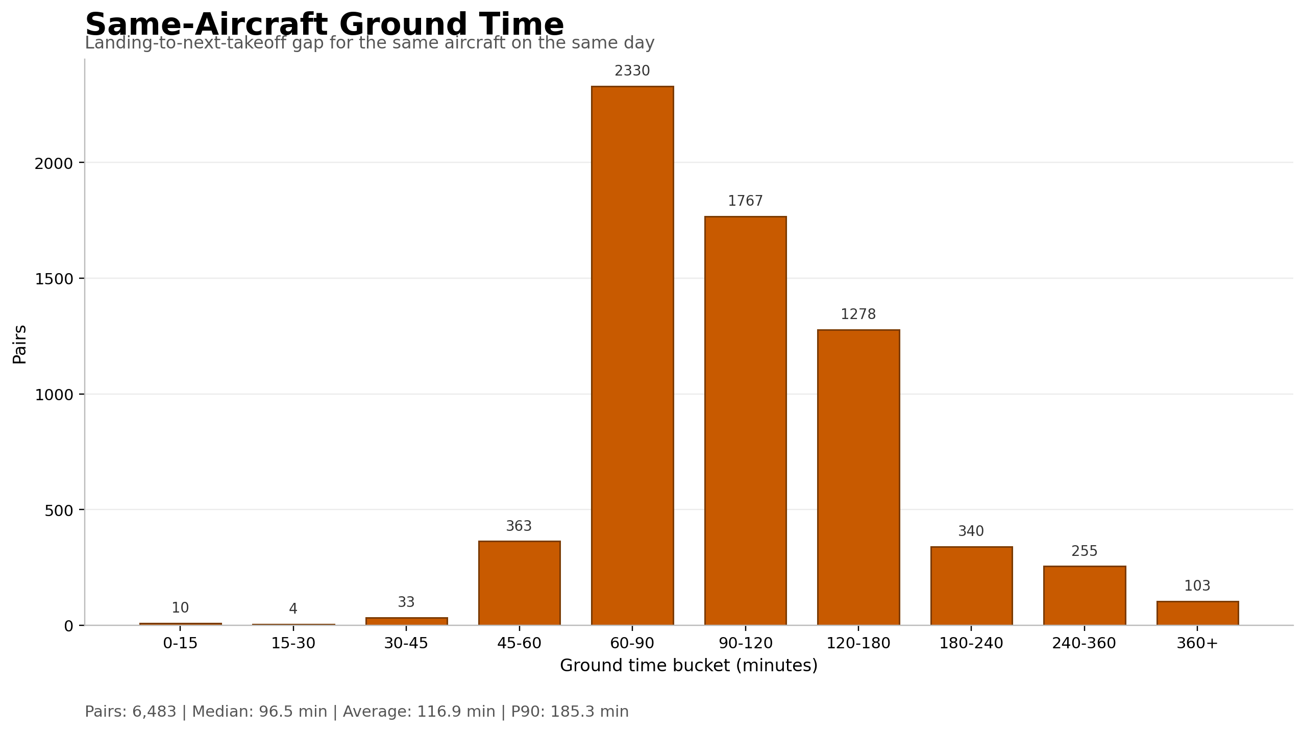
What I observed: The turnaround time is steady, but not extremely fast. The median ground time is 96.5 minutes, which is about 1 hour 37 minutes. The middle half of the aircraft stays between 77.5 and 130.5 minutes, and the 90th percentile goes up to 185.3 minutes. Most of the pairs sit in the 60-180 minute range, which suggests a working fleet that is being reused at a regular pace rather than left idle for long stretches.
That also hints at the kind of airport Mumbai is. This looks much more like a high-frequency rotation airport than a place where aircraft disappear for half a day between uses. A lot of the traffic is probably made up of domestic and short-to-medium-haul operations, where the same aircraft can land, sit for a bit, and then go back out again within a couple of hours. So the takeaway is not just "there is a gap" It is that Mumbai keeps the aircraft moving in a fairly tight loop, which fits the airport's reputation for being heavily used and constantly in motion.
International vs Domestic Flights
I also wanted to see how much of Mumbai's traffic is Indian-registered versus foreign-registered. I could not see the route directly in the ADS-B feed, so I used aircraft registration as a proxy: VT- for Indian-registered aircraft and everything else as foreign-registered. That is not the same thing as domestic vs international routes, but it gives a useful high-level split.
┌────────────────────────┬───────────┐
│         bucket         │ movements │
│        varchar         │   int64   │
├────────────────────────┼───────────┤
│ Unknown                │      3399 │
│ Indian-registered (VT) │    110492 │
│ Foreign-registered     │     37589 │
└────────────────────────┴───────────┘
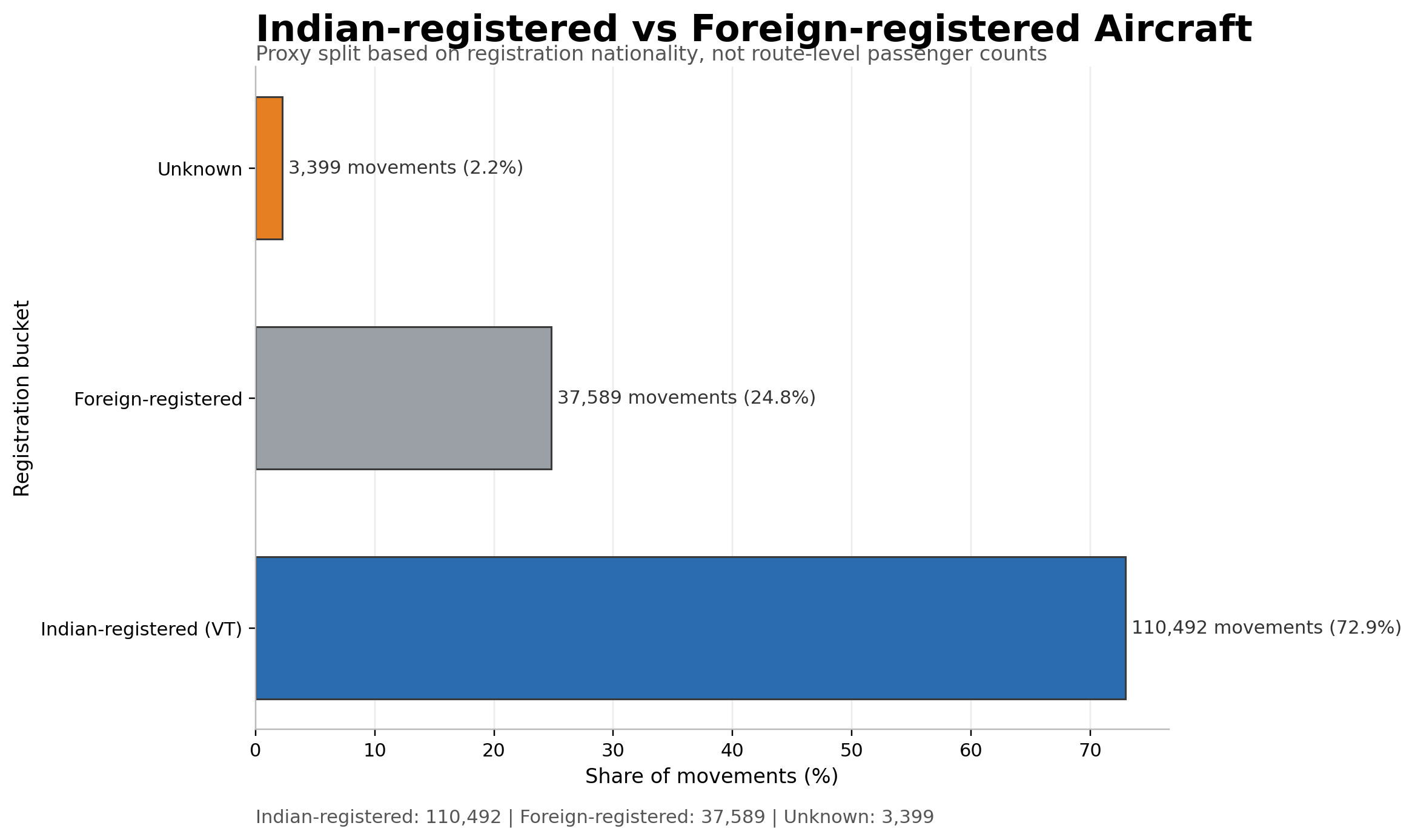
The result is clear: about 72.9% of movements are Indian-registered, while 24.8% are foreign-registered.
So the airport is still dominated by Indian traffic by count, but foreign aircraft are not a side note, or even a minority. They are a substantial and regular part of the flow.
What Surprised Me
What surprised me most was not that Mumbai is busy. I already expected that. What surprised me was how tight and consistent the whole system is. The airport does not just have a lot of movement, it has a deadly consistency to it. A landing is followed by a takeoff almost immediately, the same aircraft comes back into service in about an hour and a half, and the busiest hours are not random bursts but repeatable peaks that keep showing up in the same parts of the day.
The other thing that stood out was how directional the traffic is. Once I started looking at landings and takeoffs on the map, the pattern stopped looking like scattered noise and started looking like a corridor. The airport is not using the full sky evenly. It keeps leaning on the same approach and departure axis, which makes the movement feel much more concentrated than a simple flight count would suggest. I mean that is no brainer, since it can disrupt the residential living, the noise and the unpredictable zoning of planes is not airports should be doing. And Mumbai does it very neatly.
I also did not expect the weekday pattern to be so uneven. I assumed the traffic would be roughly similar across the week, but Saturday clearly pulled ahead in the sample. That was a good reminder that airports are not just shaped by the clock, they are also shaped by the calendar. Even with a dataset this limited, the weekly pattern still shows through.
There is the big myth which gets debunked here, that is "Mumbai Airport is busiest in the late night". Opposite is true here. The airport is busiest in the morning and evening, and quietest in the late night. The airport is not empty for long. Though there might be international flights in the late night but they don't land and takeoff with the frequency as close as Indigo does, so that Mumbaikars can sleep finally.
Another small but satisfying surprise was that the numbers matched the memory. As a child, I had the feeling that Mumbai's sky was never empty for long. The data backed that up. It felt satisfying to see the numbers in front of me for the frequency of landing, the takeoff to landing gaps, the dominance of airline, and mapping them to intuition and memories. The frequency is consistent like crazy, the turnaround period really tight, people do have a favorite preference of Indigo, everything just feels calm but its really quick and consistent. The airport really does stand up to its name "Single Runway Busiest Airport".
Conclusion
Well! That was a lot I admit. But it was fun. Atleast to me (I had said, it was a post for me!). I hope you got a little smile out of it if not just felt good reading about how Mumbai's Airport Operate. This is still ADS-B data, so it is a proxy, not an official operational log. But for the question I started with, it is enough. The feeling I had as a kid was real, Mumbai's sky was never empty for long. The frequency of landing is truly at 2 minute 30 second roughly speaking, which just makes me feel joyous, the airport turnaround time is quite a sharp and tight one, making it really a Mumbai-like busy runway. But that is just part 1 buddy! Haven't nerded about the complications of ADS-B data and my struggles of it, fighting with the limited disk space to compress the data and juggernauting queries to get results. That is the next part.
Check out the full case study here -> Flight Observatory - Mumbai Airspace Case Study